Excel has many features for working with tables, making filtering, referencing, and getting totals easy. However, just using regular tables in Excel can make it challenging to summarize and analyze that data. This is where PivotTables come in.
PivotTables are a valuable tool for breaking down and summarizing data in large and small amounts, making that information easier to analyze. Additionally, you can turn PivotTables into charts, creating handy visuals.
To pull data from Dynamics 365 into Excel, you can easily build and export views or set up a direct connection to your database from Excel. For a refresher on customizing and exporting views, see Microsoft’s documentation for How to Create and Manage a Personal View and How to Export Data to Excel in Power Apps.
In Microsoft Dynamics 365 (D365), users can export data statically or dynamically. Dynamic export options connect with D365, allowing users to quickly refresh information. However, in Excel you cannot edit the query used to connect to D365 – if you want to change filters or what data comes into your spreadsheet, you’ll need to modify the view in D365 and re-export the data.
If you’re looking to connect Excel to Dynamics 365 in a way that allows you to update your query, easily pull in data from other tables, and transform the data, see our article on Connecting an Excel Sheet to Dynamics 365 Dataverse Environment.
In this article, we’ll focus on showing you how to create a PivotTable and provide an example scenario to illustrate its use.
Creating a PivotTable
PivotTables are based on table ranges in Excel. If your data isn’t in a table range, Excel will try to detect the range when you insert a PivotTable automatically.
To create a new PivotTable:
- Select a cell in your table range or highlight the table range.
- Select “Insert” in the top Ribbon.
- Create a table in one of two ways:
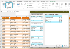
- Select “Recommended PivotTables”:
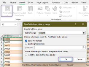
- Select “PivotTable”:
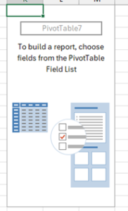
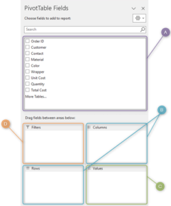
Once your table is created, you’ll see the “PivotTable Fields” pane:
A. The fields are in your source table, and you can add any other custom fields to the PivotTable. Drag these columns into the different sections to add them to the PivotTable.
B. You can group your data using columns and rows. If you have multiple fields in the “Rows” group, they’re displayed in the PivotTable as a hierarchy and can be collapsed.
C. When you add a field to the "Values" group, you can then choose how to summarize the information, such as by summing or averaging the values. If this group contains multiple fields, it adds the value labels to the "Columns" group by default.
D. Add fields to the “Filter” group to add a slicer above your PivotTable. You can add many fields to the "Filter" group; however, if a field is already in the "Row" or "Column" groups, it moves to the "Filter" group. You can't place fields in both the "Filter" group and in either the "Column" or "Row" groups simultaneously.
Let’s look at a basic situation where PivotTables are helpful.
Example: What materials are ordered the most, and in what colors?
OuterSupplies sells supplies for outdoor construction and decoration, and they want to see what materials are most popular.
Here is an example of their orders table:
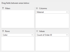
OutdoorSupplies is looking to count the number of orders by material and color. The groupings, materials, and colors will be our columns and rows. We need to count a set field to determine how many orders there are for each color and material. In this case, we’ll use the Order ID.
Here is how the table is set up:
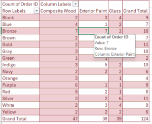
And here’s the outcome:
We can now see which materials and colors are ordered the most and which combinations of colors and materials are most popular.
Conclusion
PivotTables are a powerful Excel tool that makes it easy to break down large amounts of data. By exporting views from Dynamics, or connecting Dynamics to Excel directly, we can then build PivotTables to summarize and analyze information about orders, customers, and more.
If you’re interested in how to make the most of the connection between Microsoft Dynamics 365 and Excel, or other ways in which you can improve and analyze your CRM data, reach out to us at info@toplineresults.com or call us at 800-880-1960.


You must be logged in to post a comment.