
If you are an organization that uses Dynamics 365 solutions, you are probably aware of the updates provided by Microsoft called “release waves”. Hot off the press is the 2022 release wave plan 2. A plethora of features will be available across several apps from October 2022 through March 2023. In this blog, we will review the new Sales usage reports.
The name of this feature is deceiving as the term reports usually indicates the ability to print. The Sales usage reports are a set of dashboards that serve up analytics on two tabs; one for Opportunity Usage Reporting and the other for Lead Usage Reporting. These dashboards are exciting as they serve up Power BI analytics directly within CRM! They are interactive so you can click inside a panel and all the dashboard panels will update based on that selection.
The analytics page needs to be enabled by your administrator https://learn.microsoft.com/en-us/dynamics365/sales/enable-sales-usage-reports and has two tabs; one for sales and one for leads usage.
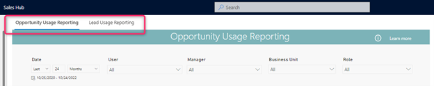
This first section of the page includes filter options for Date, User, Manager, Business Unit, and Role. These filtering options are especially useful for large organizations that need to pare down large data sets. Filters set on the opportunity tab carry over into the leads tab for easy targeting.
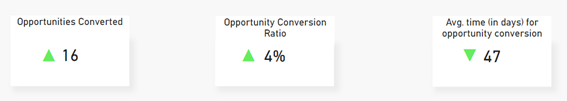
Below the filter section is a set of three KPIs and four panels of data. The KPIs show a summary of the selected date range, the percent change during the period, and the trend of how the KPI is doing compared to the previous timeframe.
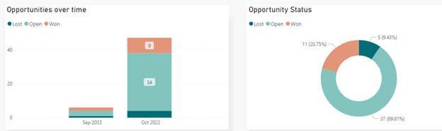
In the next two panels, we see opportunities over time and opportunity status.
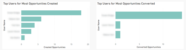
Finally, the last two panels display users with the highest number of opportunities created and converted. (For security purposes, we have blurred out our user names below.) Here’s where the “report” gets interesting. If you click on a user name, for example, all the panels will update based on the criteria selected – just like in Power BI!
 The Leads tab shows the same KPIs and charts related to your leads data.
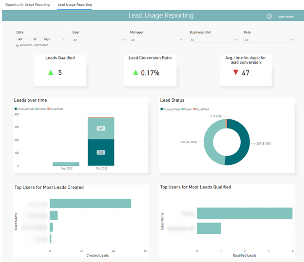
Bonus! The four panels are interactive in the Lead Usage tab as well. We hope you find this update exciting, it’s a chance to get more familiar with using analytics without much customization.
If you’d like to learn more about using Power BI, check out our recorded session https://www.toplineresults.com/view-webinar-powerbi-kpis/ If you prefer human interaction, call or email us to schedule a free demonstration of how analytics can help drive sales at 800-880-1960 / info@toplineresults.com. We look forward to hearing from you!
You must be logged in to post a comment.